How to Use Typography to Improve Your Website’s Design

The idea some people might have is that typography is a minor aspect when we build our websites, and they could not be farther from the truth. If you could choose one website that you visited last, which one would that be? It was possible to easily read through the text and could the fonts used chosen for the brand appropriately? If the answer is yes, well then this is all due to smart typography Which of these assertions do you think receive more attention today Yes or No? In this article, we are going to discuss how the typography could make your website design much better and why you should pay attention to it.
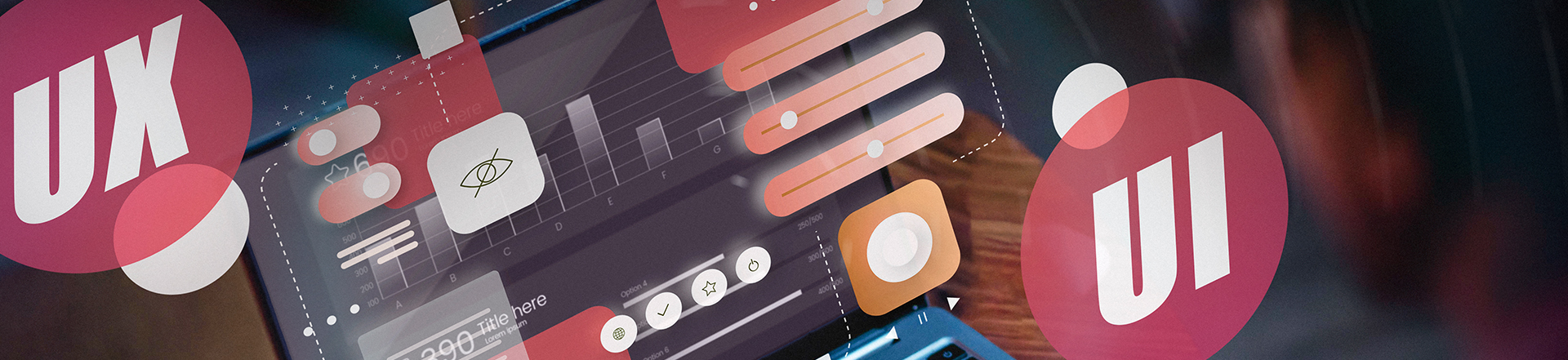
Typography in Web Design?
Let’s start with the basics. Typography is the process of organizing type, the font style, size and the space between lines and margins and way words are arranged to form written text that is unhurried on the eye and aesthetically appealing. This, indeed, means that typography in web design is not about choosing a font: It is about building a language, which would cohere in such a way as to tell the visitors of your site where they should be gazing and what they should be doing with their eyes there.
Typography as one of the site’s aspects
Typography influences your total presentation of your website to a very large extent. It sets the tone and the feeling that is established for the particular site whether it is a business page, formal but enjoyable e-shop, or an artist’s portfolio. Typeface embodies the identity of your brand and if the message portrayed is wrong it will push of the customer and create traffic bouncers.
Typography is Everything in User Experience
For the technical aspect of designing sites the most important idea is the usability of specific site. If the visitor does not understand the text or graphic, or if the visitor cannot navigate across your site, let me assure you that he will leave your site faster than you would say ‘bounce rate’. Typography has the function of deciding how people interact with your content either positively or negatively.
Readability and Legibility
If the text is difficult to decipher, your web visitors will only bounce and never get a chance to read the message you have for them. Typography role for Web design is to ensure you have got great looking readable text on your Web page. This involves choosing an appropriate font, getting it right when setting up the measuring tape which is a reference to the line height and finally ensuring that the color of the text contrast with that of the background.
On the Subject of Constructing a Structure of Data
Another significant function typographic practice to set as significance informational content of the privilegged space. The font size and weight are the ten basic items from which the reader is guided through some of the content in a fairly predetermined sequence. The large apparent title gives the start and variations of sizes in body text inform the viewer of the next point to read. Such a structure ensures that the reader is with it all the time without feeling that he or she is trapped by so much information.
The Issues Of Type To Focus On
Here are some typographic features that you need to pay additional attention hat I want to draw your attention to as they will contribute to making your website stand out in a good way.
Choosing the Right Fonts
In typography design the first strategic aspect that is general involves selecting fonts proficiently. Choose fonts that are going to express your company’s personality and its philosophy. For example, a designer developing a logo for a luxury car manufacturer may and might incorporate serif whereas, a designer developing logos for a technological company may incorporate sans-serif. Make sure also that the fonts selected are readable small across all the different hosts as well.
Font Pairing
Font pairing is an art. While using many fonts all the appearance looks unstructured while on the other end if using few fonts, everything appears rather monotonous. Ideally about the curtains and about the fabrics which are used to make the furniture, it should be in the harmonizing font. It will be preferable if the website has a single style for headings and a second style for body figure things and the rest. For example, while suggesting headers and titles in a black bold high contrast serif type looks good with a white simple sans-serif body type.
Font Size and Line Spacing
It is the size of the fonts and the proportion of margins below and between the lines that defines the general readability of texts. When the text is small it becomes very difficult to read and when the text is big just feels contrived. That is why choice of line height (leading) to avoid text density is also crucial as well. As for the line height, it is suggested always to make it twice the targeted size of the font in order to have many lines of text being separated by other such lines which makes it a little less tiring on eyes.
Typography in Branding: Sideways
Typography is more than just aesthetics – It has the function of a key cog in your marketing strategy. Clear typography and a properly chosen one is also good for the image of your brand, of its character, it also means that it has been chosen in correct way.
Consistency Across Platforms
Such consistency in typography has to be hour-for-hour when your branding is active on various platforms. It is specifically noticable (if) you have a completely consistent look of your web site, social media profiles, and/or e-mail newsletters – and that is fonts. This makes it easier for the customers to remember your business and to engage it frequently this is why it is referred to as brand recognition.
Type and Brand Character
Fonts are particularly associated with personality in nearest way. However, creative brands require aggressive Typefaces while clean, professional, and legalistic website are best suited for Law firms or corporate websites require best clean, Professional Typefaces. Now, as you plan to use some particular fonts for your web site, you have to think about the image you have in front of your customers. What kind of people you are, the person with serious attitudes or peoples with humorous attitudes. Innovative or traditional? The right font does that in an instance too.
The Psychology of Typography
I’m not kidding, it even seem to give a psychological impact to your site visitors as to what type of fonts to use. Typography is the art of type design including typefaces, different sizes, and sort of colors that convey different feelings and therefore;
How Fonts Affect Emotions
And it should be mentioned that fonts can define certain atmospheres. For example, the cursive font will give the designed shape a luxurious or old school look while the bold fonts will make a design appear more urgent or powerful. The user can come to know that some of the fonts are happy and the other ones are sad or tragic and hence can select the right font that could be related with the website’s purpose of making the concerned audience feel that sad or happy.
Color and Typography
Another area I find affected by the choice of colors is typography. Using the correct colours with your selected fonts you can have a much stronger emotional appeal to the visitors. For example, the colour blue might symbolize trust; green for growth and on the other hand, red to grab attention and make a call to action. What it means is that your typography and color should be well balanced to have the right feel as that of the web site.
How To Choose and Implement Typo Graphic Styles
Well, you already have the basics in tow, it is now high time that you were informed of some tips that can help you get the best out of typography on any website.
Keep It Simple
It is very important to learn you should not go for different colour combinations and font style and size. Font choice should also not be overwhelming; you should consider using not more than two or three. It’s just easier that way, it makes the navigation better and your site looks more professional if you know what I mean.
Test and Iterate
However, it seems that Typographical is not a set it and forget it kind of thing. Try out the typeface in many different sizes and types of leading in an effort to understand what will be ideal for the audience. An pla an experiment using the AB test to see what difference the slight modifications of the typography will do with the response and conversion rates of the users. The more you are finicky, the more you will get abreast with wants of your audiences.
Conclusion
Typography is not just a frivolity of your create web site; it is a component of your usability design. As simple as making the text more easily readable or just as simplistic as matching the language to the brand personality, great typography makes a world of difference on the website. Therefore considering the right fonts, setting the readability and also about the psychological properties of types are the elements which created not only the clear and easily navigated web-site but also the entertaining web-site to be here and there as well.
FAQs
This brings into focus how typography aids web designers target and accomplish those design goals.
Typography allows people to read easier and with what can be referred to as joy, establishes a hierarchy, aids in setting the tone, and therefore aids when dealing with the user.
Font pairing is the first concept that should be defined to comprehend the ways in which fonts can work together.
Typography is the action of defining two or more related fonts for the headings and two or more unrelated fonts for the textual content. There is the aspect of balance in the manner of design, and coordination in the way it is presented to the viewer.
What is the best way to go about choosing the right font type in a website?
Choose easy to read font that will suit your brand’s personality to the dot and which will look sharp and legible online and offline. It is this type of typeface that should make considerations to aspects such as style, readability and the feelings it creates.
To the extent that it is feasible in terms of both the empirical reality of web design and the theoretical infrastructures dating from the 1990s, the question can be posed: can typography help my SEO?
Typography does not influence the SEO position of a given webpage directly, although the correct application of typography is useful to the user and, thus, to the SEO.
What is the most effective way of passing your typography design for checking?
Depending upon the available options, it is possible to conduct A/B testing on font style and its placement and see the impact which these have over the users: duration that a particular consumer spends on the page and the proportion of conversion.
Sign Up To Get The Latest Digital Trends
Get free Consultation on Web Design
Related Posts